-
 EUCEB
EUCEB
-
 Echinoderm
-
 Sika deer
-
 Factorial
-
 Otherness
-
 Mammal
-
 Blennorragia
-
 Ogg Vorbis
-
 Vitamin B2
-
 Androgens
-
 DNA ligase
-
 Levodopa
-
 PSA
PSA
-
 Ultrafiltration
-
 WDM
WDM
-
 SPICAV
-
 Speckled wood
-
 Axial skeleton
-
 Leek
Leek
-
 Ginkgo
-
 Frequency
-
 Rydberg atom
-
 Nuit des étoiles (Star night)
-
 Transplantation
-
 Whopping cough
-
 Catalysis
-
 LEO orbit
-
 Oviparous
-
 Galaxy cluster
-
 Broadband network
Boxplot
In statistics, a boxplot is a graphic representation. It is also called a box-and-whisker diagram.
Typically, the boxplot enables the median, the quartiles and the centiles (5th and 95th) or the deciles (1st and 9th) to be represented. Anomalous data are also often represented (outliers).
It can be found in various forms in which the minimum and maximum of a sample are represented instead of centiles or deciles.

A set of data where the quartiles, deciles and median are represented. © Bruno Scala
The diagram above shows a set of data separated into quartiles and deciles. The median is also shown.
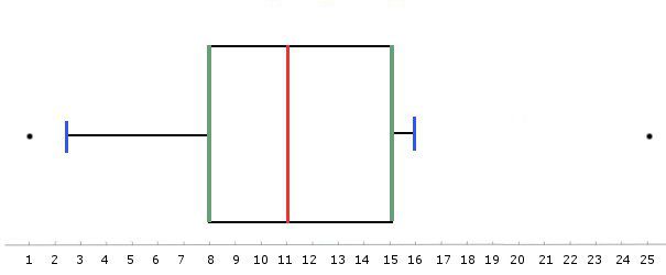
The boxplot corresponding to this set of data (below) highlights the median, the1st and 3rd quartiles and the 1st and 9th deciles.
 Graphic representation as a boxplot. In red, the median, in green, the first and third quartiles, in blue, the first and ninth deciles. The black points are outliers. © Bruno Scala
Latest
Fill out my online form.


